
PLANNED CONSTRUCTION AS UNTAPPED POTENTIAL AIRBNB REVENUE
PROJECT OVERVIEW
New York City is one of the world’s largest real estate markets, as well as a leading tourist destination. This combination makes it a highly valuable market for Airbnb. According to a June 2019 report by Statista, New York City was Airbnb’s second-largest market in the US in terms of number of listings at the time. The growth of the city shows no sign of slowing down, with many large construction projects underway or scheduled.
This project was carried out to function as a tool for analyzing and geospatially visualizing planned construction in New York City in terms of potential future Airbnb revenue. The end product could be used either internally by Airbnb, or externally by the City of New York, financial companies, or other stakeholders. For example, Airbnb could benefit by observing the areas with the strongest potential in terms of future supply, consequently planning their physical marketing campaigns to target Airbnb hosts in those areas. As another example, financial companies could use the information as a tool for determining future growth, a foundational part of calculating company valuation.
This Tableau map is an interactive replica of the Lealet Folium-map that is generated from final_project_code.py. The Tableau map is based on data from 12/2/2019.
PROJECT RECREATION INSTRUCTIONS
Project Map - Follow the steps below to recreate the project map.
- Download AB_NYC_2019.csv, final_project_code.py and the final_project_bar_chart.py from the Github repository. Disregard the planned_construction_11-25-19.csv. This file contains the data about planned construction in New York City, which will be automatically collected in the script, given that you are connected to the Internet.
- Open final_project_code.py and change the file directory on row 13 to correspond to the location where you put the AB_NYC_2019.csv file.
- Change the file directory on row 70 to correspond to the local directory of your computer where you are hosting the other project files. The generated CSV-file is used for creating the bar chart (instructions to follow below).
- Run the script
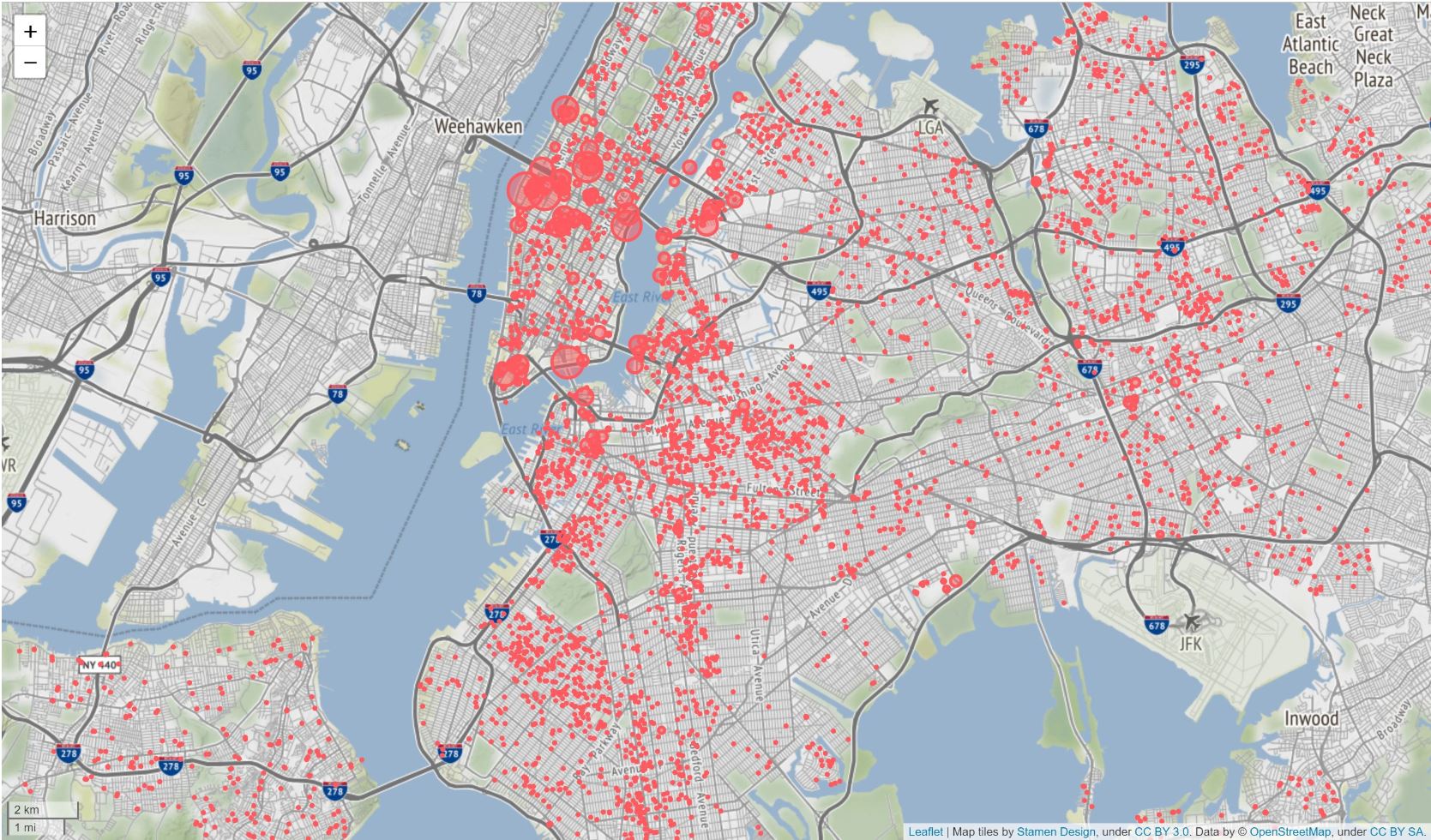
- If executed correctly, there should now be an HTML-file named “airbnb_potential_revenue_NYCmap” in your local project file directory. This should be the same as the map picured below (afer step 6).
- Open the HTML file and interact with the map. Click on the red data points to see what the total potential Airbnb revenue is per night for the planned construction location.
Bar Chart - Follow the steps below to recreate the bar chart.
- Open the final_project_bar_chart.py that you downloaded in step one for PROJECT MAP.
- Change the row 4 file directory in the script to the location where you saved the dataset (“const1”) created in step 3 for the PROJECT MAP recreation.
- Run the final_project_bar_chart.py script.
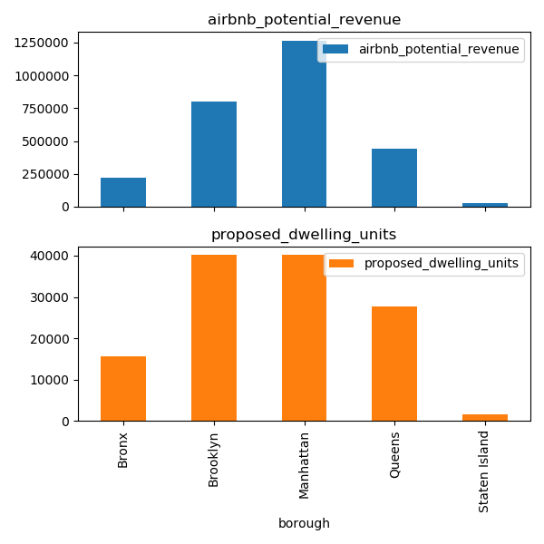
- If executed correctly, a bar chart should show up on the screen. Save this graph to the project file directory. The bar chart should look like this:
PROJECT WORK PROCESS
- Airbnb data was collected from Kaggle.com, and the planned construction data was derived from NYC Department of Building’s Active Major Construction. Both CSV-files are attached in the Github repository.
- The Pandas software library was used for data analysis and manipulation in Python. Two Pandas data frames were created, holding the Airbnb and construction data respectively.
- Average price per Airbnb unit per borough was assigned to five variables (one for each borough).
- A subset data frame, named “const1”, was created from the planned construction data set. This subset contained only the required columns, as well as a new column holding the total potential Airbnb revenue per row (i.e. per project). This column was derived from multiplying the mean unit price variables per borough with the planned residential units per row, and then additionally adjusted to represent Airbnb’s revenue by incorporating a variable holding Airbnb’s average fee.
- The Python library Folium was used to integrate a Javascript Leaflet library for creating a map of the potential Airbnb revenue areas. The longitude, latitude, and Airbnb potential revenue columns were fed to the Folium code, generating an end product in the form of a geospatial bubble map of New York, with the bubble location representing each planned residential construction site, and the bubble size representing the total potential Airbnb revenue from each construction site.
- Labels were added to provide enhanced understandability of the map so that when a bubble is clicked, a window opens up and displays the potential revenue.
- To generate further insight, I create a simple bar chart visualization using Matplotlib in another Python script.